
Five Stars — Movie & TV Tracking App
UX ResearchFigmaCard Sorting
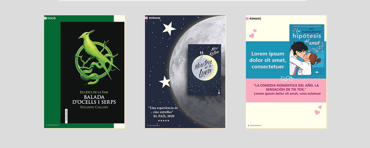
Book Magazine is an editorial design project built around book recommendations and literary content. The project explores different visual compositions for presenting books — combining typography, imagery, colour, and layout to create a dynamic and engaging reading experience across five spreads.
Editorial design often falls into safe, predictable layouts — especially for literary content. The challenge here was to create a magazine that felt genuinely engaging: one where each spread has its own personality without losing the coherence of the whole.
Design a five-page book magazine that communicates literary content in a visually compelling way, experimenting with composition, typographic hierarchy, and colour — while keeping the reading experience natural and enjoyable.
Editorial Designer — concept development, layout design, typographic system, colour exploration, and production in Adobe InDesign.
I started by analysing a range of editorial references — from literary journals to independent print magazines — looking at how designers use grid systems, white space, and typographic scale to guide the reader's eye. The goal was to understand what makes a spread feel dynamic without feeling chaotic.
The concept centres on giving each spread a distinct visual character — its own rhythm, scale, and colour — while holding the whole together through a consistent typographic system. Think of it like chapters in a book: each one has its own feel, but they're all part of the same story.
I began with rough thumbnail sketches to test different compositional approaches before committing anything to InDesign. From there I developed a core type system — a serif for body and display, a grotesque for labels and captions — and built a colour palette that could shift mood across spreads without feeling disconnected.
With the concept locked in, I moved into InDesign to build out each spread. I worked spread by spread rather than page by page, so each two-page unit could be designed as a compositional whole. The layout decisions — column structure, image cropping, type sizing — were all driven by the content rather than a fixed template.
The refinement phase was about pushing the details — tightening spacing, adjusting type sizes, reconsidering colour relationships between spreads, and making sure every page held its own while still reading as part of a coherent whole. This is where the project really came together.
The final magazine is a five-spread editorial piece that demonstrates a range of compositional approaches — from full-bleed image layouts to type-led spreads — all held together by a coherent typographic system and colour palette. The project shows how visual hierarchy and layout decisions can shape how content is read and felt, not just seen.
This project taught me that constraints are a tool, not a limitation. Working within a fixed number of pages forced me to be deliberate about every decision. I also came to appreciate how much the refinement phase matters in editorial design — the first version of a layout rarely captures the right rhythm. It's in the iteration that things click.

Browse by Discipline