
Five Stars — Movie & TV Tracking App
UX ResearchFigmaCard Sorting

Salvatge Energy is a branding project developed from scratch during a university semester. The work covers the complete identity system: user research, naming, logo design, colour palette, and can packaging. The project then extends into a brand collaboration concept with Sónar Festival, adapting the identity to a festival merchandise context without losing either brand's personality.
The brief called for a brand-new energy drink identity built around a natural positioning — a tricky combination, since the energy drink market is dominated by bold, aggressive visuals that tend to feel anything but natural. On top of that, the identity had to work internationally, read clearly across different formats, and later adapt to a festival collaboration with Sónar without looking out of place.
Create a complete brand identity — name, logo, colour system, typography, and packaging — for a natural energy drink aimed at adults between 18 and 40. The brand needed to communicate strength and energy while clearly differentiating itself through a natural visual character. In the second phase, adapt that identity for a Sónar Festival merchandise concept that balances both brands.
Graphic Designer — Responsible for the full project: user modelling, visual research, naming, logo design, typography selection, colour palette, packaging design, and the festival collaboration concept including character adaptation and merchandise design.
The research focused on two areas: understanding the target audience and mapping the visual landscape of the energy drink market. Two user personas were built to represent the range of potential consumers — a 28-year-old professional athlete looking for a healthier training companion, and a 28-year-old marketing manager drawn to natural products that fit an active lifestyle. On the visual side, three gorilla-based energy brands were analysed — Gorilla Energy Drink, Gorilla Mind, and Gorilla Roar — to identify common patterns and find gaps to differentiate from.
The brand concept connects two ideas: wild strength and natural energy. The gorilla was chosen as the central visual element for its associations with power and presence, then combined with green tones and natural imagery to position the product away from conventional energy drinks. The name SALVATGE ENERGY pairs a Catalan word — salvatge, meaning wild or savage — with the English category identifier, creating something that works across languages while keeping a distinctive character. For the Sónar collaboration, the concept shifted towards integration rather than combination: the gorilla was reimagined as a festival character rather than a brand mascot placed next to another logo.
The logo was built around a simplified gorilla illustration — detailed enough to feel strong, but clean enough to be versatile. One of the key decisions was to have the gorilla break through the ENERGY wordmark, creating a sense of movement and leaving a small lightning-bolt shape in the gap. The Dissfunction typeface was modified for the SALVATGE wordmark to improve readability and create a more dynamic letter S. Source Sans Variable Bold was used for ENERGY. For the Sónar phase, the gorilla was redesigned to hold the festival logo and given green headphones as a direct reference to music — a small change that gave the character a completely different personality without abandoning the original identity.
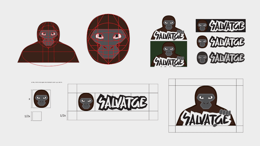
The can packaging combines the gorilla logo with plants, trees, and natural elements that create a visual environment around the product. Dark and light greens form the base, with golden accents on tree trunks and a lightning-bolt branch that reinforces the energy angle. A light green gradient behind the gorilla separates the character from the darker background and improves readability at small sizes. For the Sónar collaboration, a festival cap was chosen as the merchandise format — practical for a long festival day, and visible enough to work as a branded piece. The cap uses the adapted gorilla on the front panel and a smaller SALVATGE ENERGY wordmark on the side, following the more discreet branding approach observed in Sónar's own merchandise line.
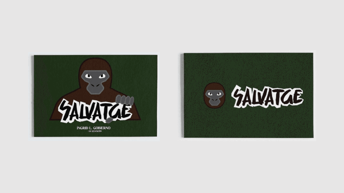
The logo was tested across multiple formats, backgrounds, and sizes — including a Logo Lab evaluation to check proportions and legibility. The collaboration design was refined to ensure neither brand dominated, with specific attention to scale, colour balance, and the physical constraints of embroidered cap design.
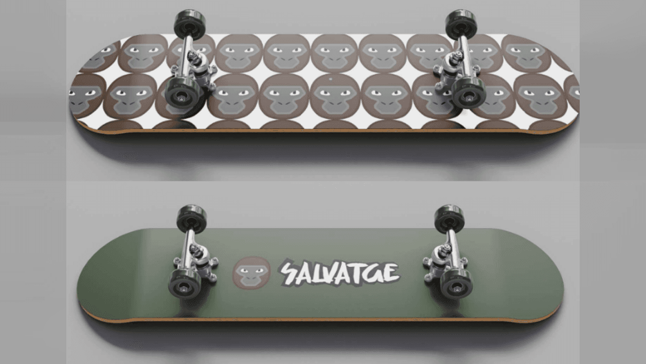
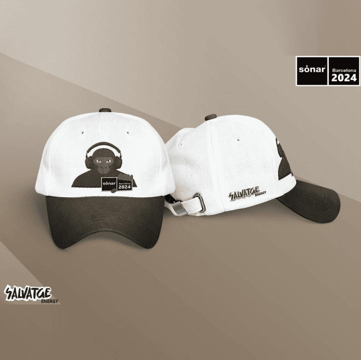
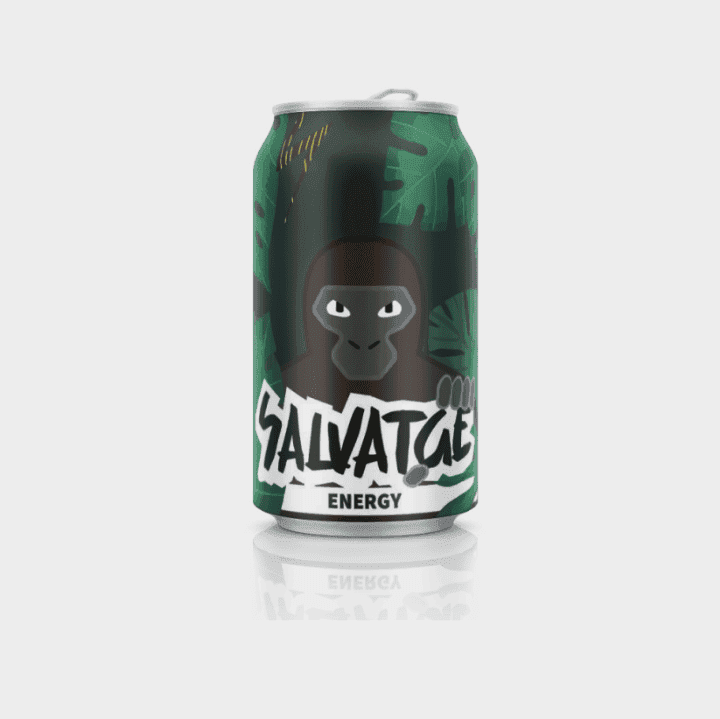
The project delivered a complete visual identity for Salvatge Energy — name, logo (positive and negative), colour system, typography, and a full can packaging design — plus a festival merchandise concept for the Sónar collaboration presented through a branded cap mockup. Both phases were resolved as a coherent visual system where the two applications feel connected rather than like separate projects.
A clear brand concept makes every subsequent decision easier — once the gorilla and the natural-energy idea were locked in, typography, colour, and packaging all followed naturally. Simplifying an illustration tends to make it more memorable, not less. And brand collaborations work best when you focus on integration over combination: adapting one brand to speak the other brand's visual language, rather than placing two logos side by side.
Download the original coursework documentation: the comprehensive Brand Identity manual and the Sónar Festival Merchandise proposal. Please note that both documents are written in Spanish as part of the academic project submission.
Browse by Discipline