
Salvatge Energy
Adobe IllustratorBrandingLogo Design

Five Stars solves the hassle of jumping between multiple entertainment apps. By benchmarking platforms like Letterboxd, IMDb, TV Time, and JustWatch, I designed a unified mobile product through Card Sorting (17 participants), paper sketches, wireframes, and an interactive Figma prototype.
View live projectFinding what to watch and tracking what you've seen currently requires multiple apps: Letterboxd for reviews, JustWatch for streaming platforms, and TV Time for episode progress. The challenge was to combine these core features into a single, clean app without cluttering the interface.
Design a streamlined mobile app where users can discover movies and shows, check streaming availability, track seasons and episodes, build custom lists, rate content, and share recommendations with friends.
UX/UI Designer — Led the project end-to-end: competitive benchmarking of 5 platforms, information architecture, Card Sorting with 17 participants, paper sketching (13 screens), wireframing, and interactive prototyping in Figma.
I benchmarked five major platforms (Letterboxd, IMDb, TV Time, JustWatch, Sofa Time) to map out their strengths and shortcomings. To validate the navigation and grouping, I conducted a Card Sorting study with 17 participants.
Five Stars is built around a dark, cinematic visual direction that highlights posters and artwork. The goal was to keep interactions fast and clear, letting users log an episode or check streaming availability in just one tap.
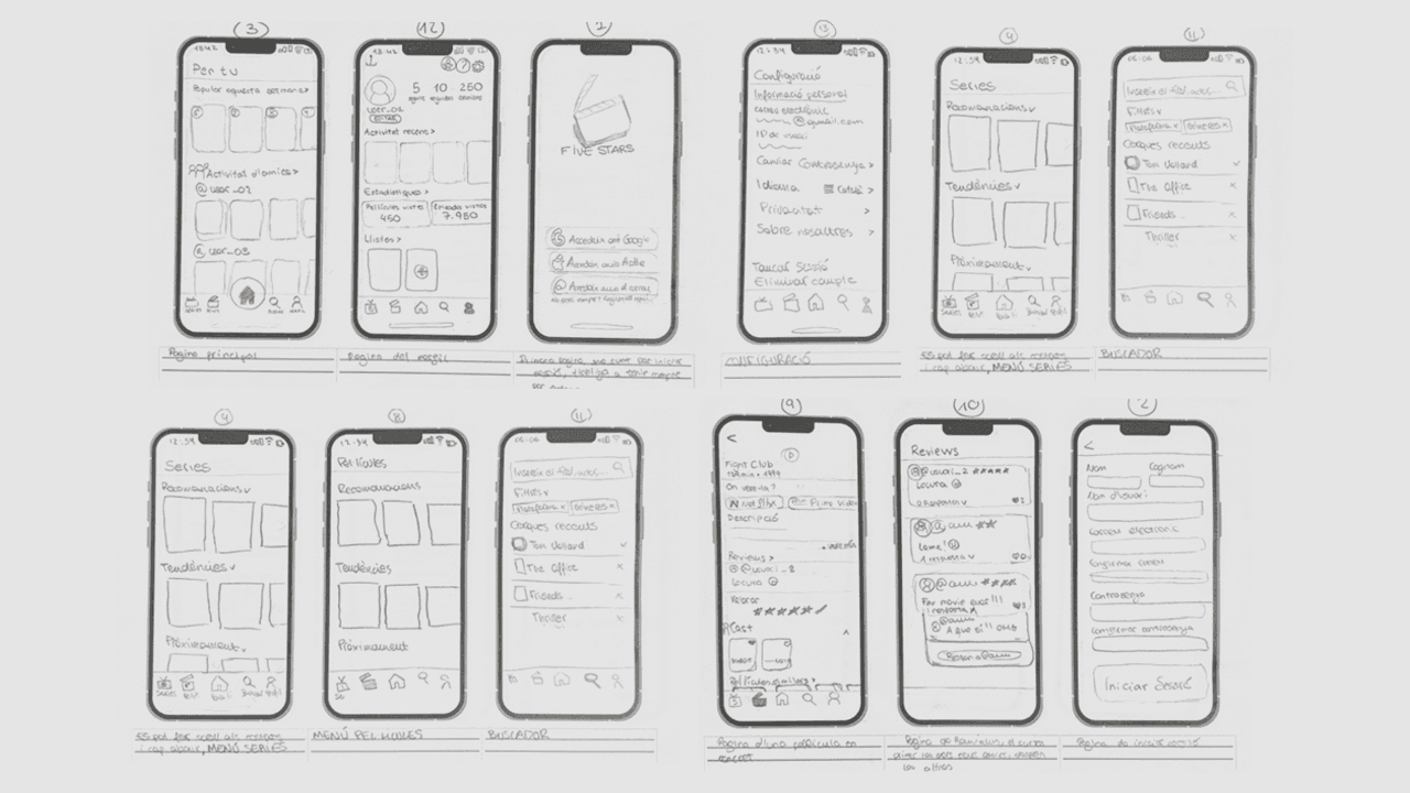
I started by sketching 13 core screens on paper to test navigation patterns and visual balance before touching Figma. This helped establish a comfortable one-handed mobile flow combining vertical feeds with horizontal carousels.
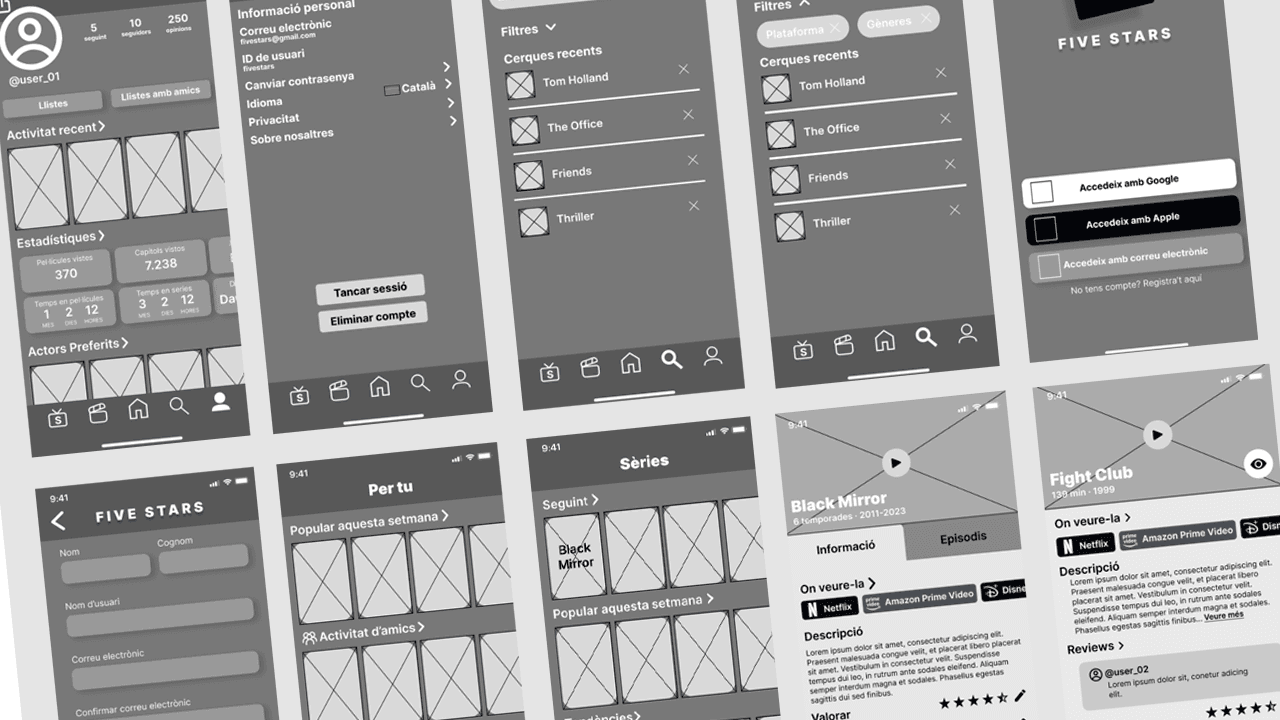
Translating paper sketches into digital wireframes in Figma helped define screen layouts, element hierarchy, and navigation flow before applying visual design. Key controls and search bars were anchored to ensure effortless browsing across long lists.
The interactive Figma prototype includes full component variants, micro-interactions, and 9 key user journeys: onboarding, discovery feed, title details, episode tracking, reviews, faceted search, and profile statistics.
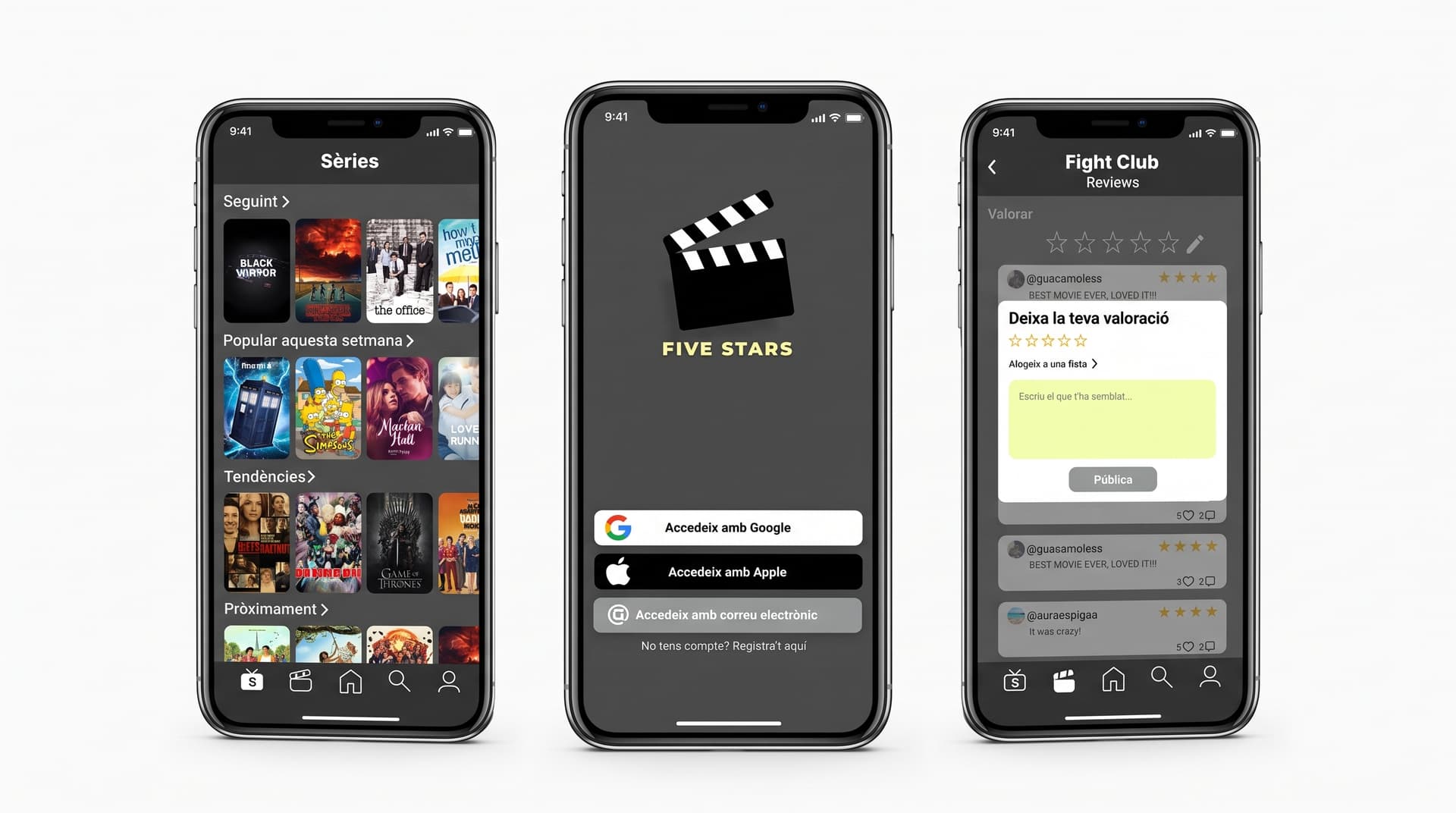
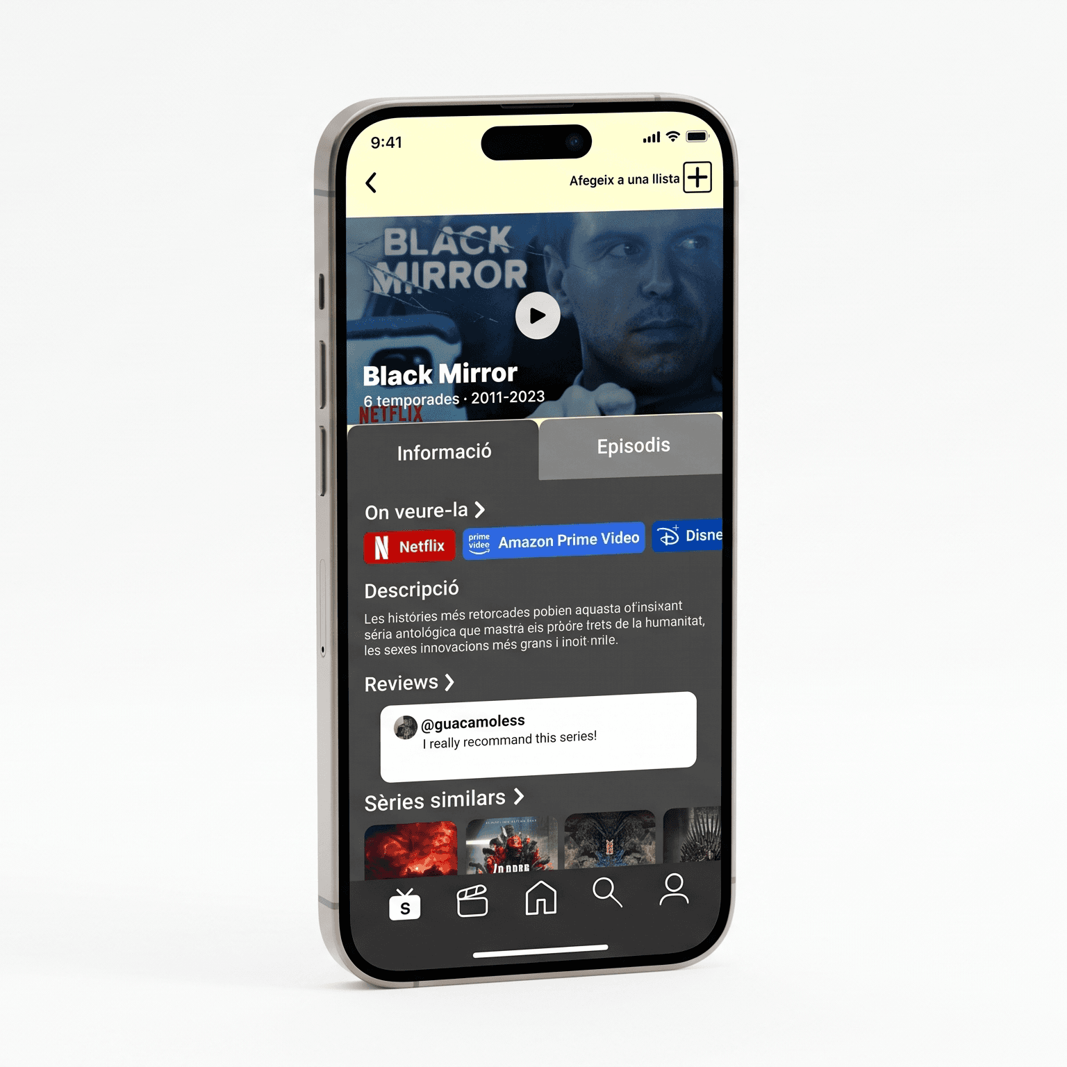
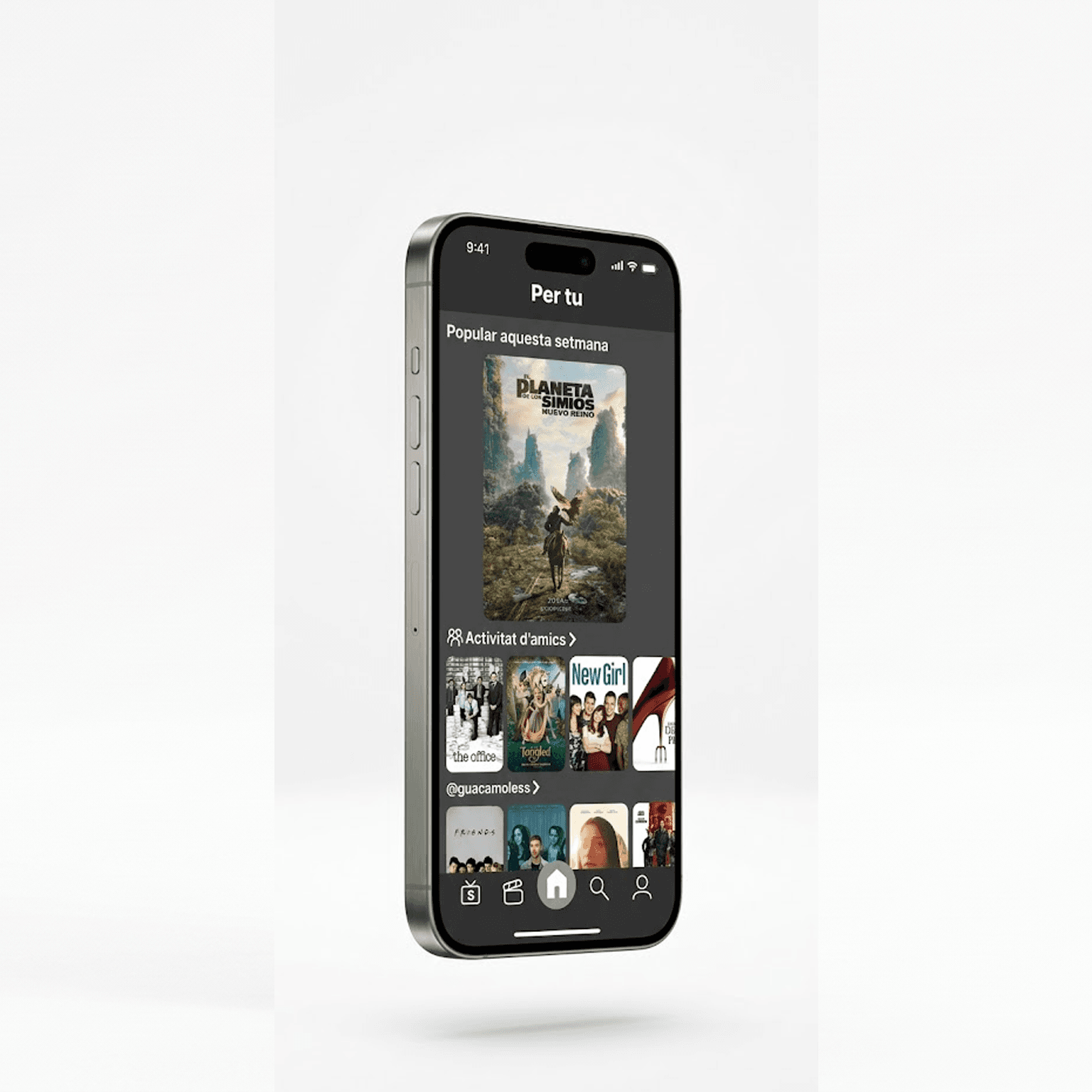
The project culminated in a high-fidelity interactive Figma prototype covering 9 end-to-end user journeys, eliminating the friction of switching between multiple tracking tools. The information architecture was validated through an open Card Sorting study with 17 participants, establishing a scalable dark-mode design system with reusable mobile components, tokenized colors, and consistent typography.
Conducting Card Sorting before designing wireframes proved essential to align category groupings with actual user mental models rather than assumptions. Iterating through paper sketches to digital wireframes allowed layout density and navigation patterns to be resolved early, ensuring movie artwork and quick tracking actions take center stage without visual clutter.
Project Deliverables & Assets
Access the full interactive Figma working file or download the complete academic documentation PDF.
Browse by Discipline